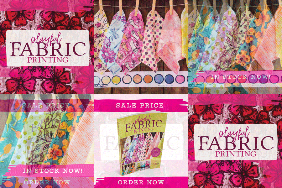
As mentioned in my previous post, we are going to press in a matter of days for Playful Fabric Printing, a co-authored book by Melanie Testa and Carol Soderlund.

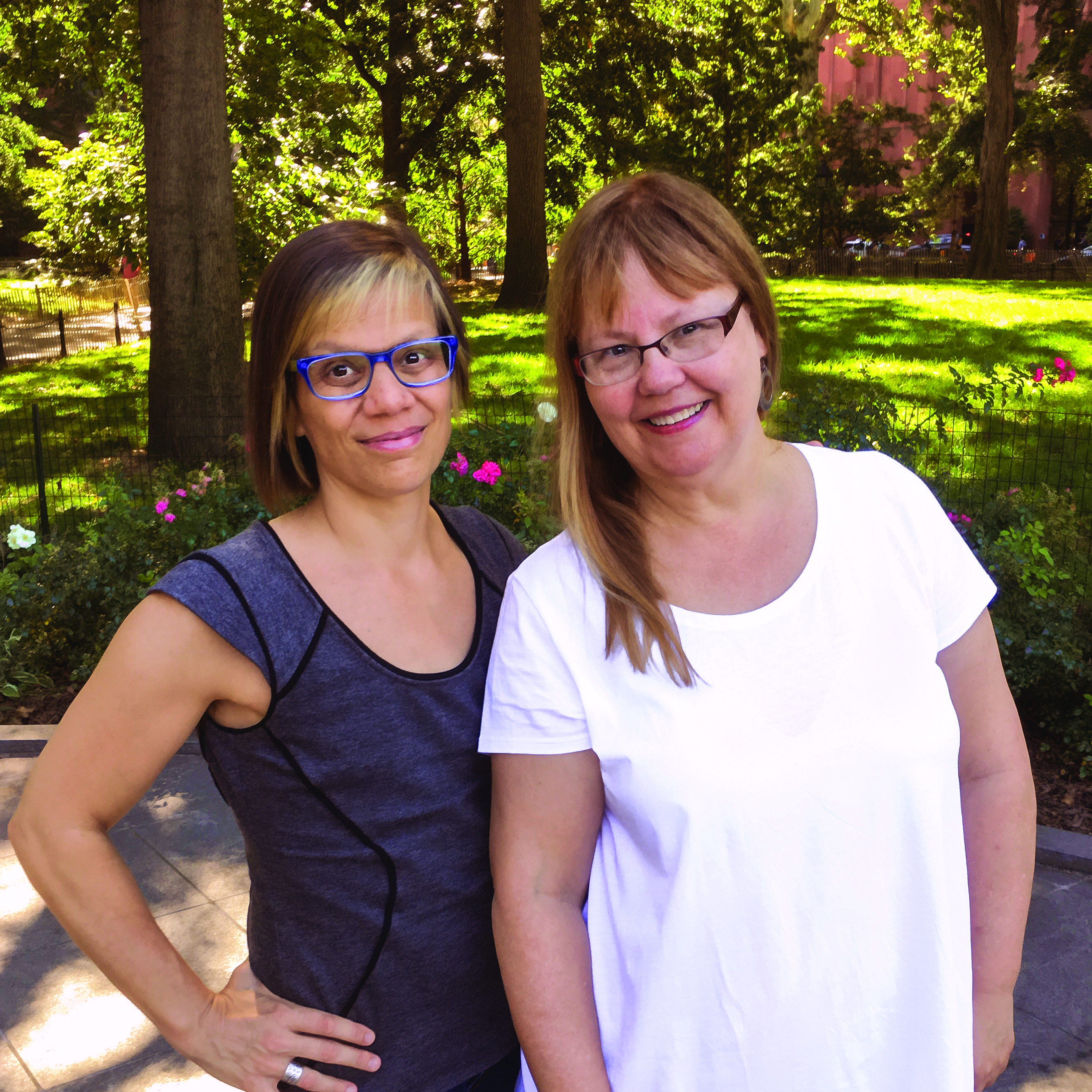
Melly Testa (left) Carol Soderlund (right)
As someone who loves surface design, printing, and quilting, I am incredibly honored to be publishing this book, and would love your help choosing a cover. If you make a choice, please leave a comment in the blog comments section, and when the book is available in January, I will randomly select 5 names and send a copy to each!
A bit more information about the book:
Printing your own fabric opens up an entire new world of design, especially for quilters, sewists, and other textile artists. Until now, the process of printing with dyes could seem difficult to learn and even harder to implement. But Carol Soderlund and Melanie Testa have taken all the stumbling blocks out of the way of would-be fabric dyers and printers.
With step-by-step advice, instruction, and photographs, this book is a master class in using dyes and low-tech equipment to print your own fabric, and it begins at the beginning. If you’ve never handled dyes before, never designed your own print motifs, aren’t even sure what supplies or space you might need, everything you want to know is here. More advanced students will value the in-depth presentation of techniques, tools, and insights into approaching fabric printing as an art and taking your work to the next level.
The opportunities for fun creative expression and producing your most original and exciting fabric work ever are unlimited with Carol and Melanie’s friendly help. It’s time to try playful fabric printing!


I chose #3 because I like seeing the different color ways and jars of ink on the cover. It indicates more possibilities than the other 2 covers do and will probably garner more interest.
I like the option 3 the best, because I like the additional photos. I would prefer a lighter gray on the text blocks, so the painted fabrics pop more. Right now the grey fights for attention with the fabrics IMO. Very exciting new project for you!
The extsrpiee shines through. Thanks for taking the time to answer.
Wishing you every success.
Though the title stands out nicely in #1, # 3 is almost as good and I like the extra small photos. Also, the subtitle is more easily read in the banner in #3 than crammed into the circle in the other 2.
the jars of thickened dye are a must!!
I chose #1..I think the bright, clear colors are what appeals to me most. I also love #3, with the jars of dye. But no matter what cover you use I can’t wait to buy this book!!
I like Option 3. It is easier to read, especially the author names. I like the font for the word “playful”. Seeing the jars of dye tells me more about the content of the book. Overall, it appeals to me more, as a buyer.
We’ve arrived at the end of the line and I have what I need!
I like #3 the best, it keeps the eye moving around the different aspects that one might expect to find out more about in the book, especially with the dye bottles, that really caught my eye!
That’s weird….. I typed my answer in the ‘survey” above, but it didn’t ask my name. So how are you going to know it was mine? Let’s see if I can recreate it since I didn’t know I should’ve copied/pasted it here – assuming this is where I should’ve typed it? Confusing!! Okay, I prefer the first, although I originally leaned toward the third. The title and subtitles in the first catch the eye better than the others, and I like the cleaner look. However, I do like the mason jars on the third, visual evidence of an easy process v. needing professional tools. I’m hoping in-process photos like this will be on the back cover, along with the authors? P.S. It’s truly impossible to see the fields in this section, have to tab to find where to type. Maybe outline the blank fields in a darker color or add shading? Also confusing to get to the survey first, fill it out and not be asked your name, then scroll further and have to do it all over again. Or at least this was my experience. Maybe too much turkey hangover? lol
I did that, too. Posted my vote but it doesn’t show and my name was not requested. So, I voted for #3. Fabrics are more visible and the paint jars at the bottom are a perfect addition. This will stand out nicely on the book shelves in stores and online.
Option #3
The additional photos add more interest & possibilities.
And even though there is more it ‘reads’ in a cleaner,less cluttered way.
Congratulations!
#1 was the best for drawing the eye to the title. Loved the photo of the bottles of dye on cover 3 but the title is more important.
Option #3 is my choice! It is the most visually appealing and the different font used on the word ‘playful’ actually implies playful!
I chose option 1, as mentioned in the survey. The title seems to stand out better, in fact, all the printed matter seems to float above the page, making the background photo seem more cohesive. For me, option 2 didn’t have enough title emphasis and option 3 seemed too broken up into sections.
Definitely #3!
The most eye catching!
What a beautiful shot of the jars of dye. They are so colorful! I would love to see that on the cover. Very different from anything else.
Can’t wait for the book to be released!
Thanks for letting us participate in choosing a cover. I selected #1, but would have chosen #3, without the bottom boxes. I prefer clean, almost full cover photos. They are all pretty great, however. Thanks for the opportunity to win a book. It looks like it will be fabulous!
I participated in the survey. I really like #3 and no matter which cover I can’t wait to read the book!
Option 2 for the reason explained.
Definitely No. 3. Somehow, the first two arrangements of color don’t hit me exactly right, and I love the jars in the third example, with the brownish, more neutral background. No. 3 makes me think something is going to happen with this book!
I chose no. 1, customer takes only 15 seconds to decide if they will pick up the book and look further, too much on no. 3 although I like fabric photo a little better, but may not fiit page when blown up.
I left comments on the survey that I would be drawn to 3 to purchase.
I like option #1, I think the colour pops more. Can’t wait to read the book.
I chose #3 for a couple of reasons
First, the small photo of (baby food?) jars of dye reinforces the notion of “playful” in the title.
I had flipped through the photos in your blog (or was it Facebook) before looking at the cover options, and I was really impressed by the fabric collection that included the turquoise with orange poppies. California poppies! I would buy the book just to make that print! Also, that collection has a more traditional “flavor” than the collection in the larger photo, which may broaden the audience a bit.
The idea that she is going to pay more taxes is suspect. I bet she qualifies for the “Earned Income Tax Credit” which is just a another welfare payment, as people who wind up getting all of their withholding back also get *more* than they paid in. She’s not “losing” anything. The article is long on whining and short on actual analysis.
Hi, I liked #3. The info at the top provided more quick info re: the usefulness of this book. Great statement about tools. I also liked the different sizes of images, they were eye-catching. Can’t wait to see this book. Congrats to all of you!
I chose option 3. It appealed to me on many levels and was the most pleasing to me. The bottles of dye, the rich colors drew me in. I would definitely purchase this book and I do not sew; however, I would use this book to create patterned cloth for gifts.
I think number one is the best. Everything seems to pop!
I think #3 does the best job in providing information and lettering that can be read.
I also voted for Option 3 and listed my reasons on the first/survey page….
Good luck on this new venture.
I also like #3. It shows all the fabrics as well as the additional fabric and dye jars. However, they are all beautiful and I would live to own this book.
Option 3. It is less cluttered, gives a hint of color play. I also like seeing the authors names clearly. You can see the possibilities of fabric with good definition, each sample stands out
I like #3: the playful font contrasting with the printed font is cool, and I love that photo of the thickened dyes in the bottles!
This is so funny. I thought I would be the lone vote for #3. I love the arrangement of cloth and jars. It wasn’t in your face, but grabbed my attention. Looking forward to getting started working my way through the book.
I liked # 3, I could see the fabrics and how they might look if I were to learn fabric printing. The magenta in the banner of the second one really appealed to me and I would suggest using that color for the word “Playful” in the third section. I love the contrast of the green and magenta colors.
I chose #3. I like the font of “playful”. I also think the grayish background brings out the saturated colors of the fabrics more. Plus, the bottles are adorable.
I’m looking forward to it!
I chose #2 because highlighting the fabrics best illustrates the books title, IMHO. I love both authors/artists and can’t wait for this book for its instruction and inspiration!!!
#3 – I love seeing the jars of dye!
#2 – I like the sketching at the edge of the photo to draw the color out.
#3
More professional looking/the typeface change for “playful” is effective, nice to see several photos….overall, if I were looking at 3 similar books on a shelf I would be drawn to #3.
I chose #1 for it’s simplicity, and focus on the fabrics… although I do love the little picture of the jars filled with dye.
Guess i dont follow directions well…either. since I typed it in the area on the post. 😉
Number 3 for me. The grey in the title is welcoming to my eyes and does not conflict with the colors of the images. The use of fonts and colors in the title says FUN to me. Love the addition of the jars and the additional peek at other fabrics in the lower images.
In the others I think the fabrics take up to much space. It is fine if a person loves all the samples there, but if not they could be turned off by it- thus seeing more variety may catch thier eye.
Option 3 is most appealing to me, it does not cover the fabric with insert of the title , the colored glasses make me wonder what else is there to see , the title on top does not take away from it but still tells me what to expect and yes I want to buy this book ! I don’t care for option3 as the title in the dark purple is distracting and I would move on to option 2 as my second choice the title is easy to read but not sure if it would be enough to actually taking a look at it .
I chose #3 for 2 reasons – It provides more information about the content, which is important when purchasing a book on line, and second, I like the color contrasts in that cover better.
#3. Gray behind title helps it stand out & type style for playful IS playful. Like additional photos to tease about what’s inside. I would pick this up to investigate. Nice job.
Option #3 works the best I think. The informal placement of the script font used for the word ‘playful’ fits well with the book’s concept.. The larger more formal block text suggests some serious insights into textile printing.
I chose #3. It looks more “instructional” than the other 2. The extra pictures give more clues about what might be inside. The font of the word “playful” conveys that feeling.
Do also voted above. I voted for #1 because of the contrasting color for the title and cleaner look
I liked #2, it had a calming, fluid look. Whichever you choose, I wish you all the best of luck!
I guess I was supposed to answer here. . . Option #1 is a nice fresh looking cover and my first choice!
#3 is easier to read. I also like seeing the jars of dye.
Number 3 for sure. Better display of the fabric and it’s easier to understand at a quick glance.
Can hardly wait to get the book into my hands.
I like the 3rd one the first two just look like blobs the third one just looks so neat
I would LOVE to receive a copy of the book Pokey!
I prefer the first book cover because the lime green surrounding the title grabs my attention the best.
ElizabethMarch 13, 2009 HI… I got lost with the star brushes step… im fresh new and i dont know how to get them… i download a star brushes set but i dont know what else to do.. i tried to open the zip file but i really dont know how to use it… i was so happy doing the others steps of the tutorial..lolPlease help me… i really want to finish it!!!
#1: Title really stands out. I like the pic with the dye in it but the other pic is a little redundant to me (similar shot with similar prints).
Not quite sure if my name will come up but I liked option 1.
It seemed brighter and the bigger pictures of the fabric intrigued me to want to look inside the book.
Can’t wait for the book!
Number 3 appeals to me! The more images the better, and the text is easy to read. Very clean look.
I loved cover #3! It looked inviting, tempting and called out to be opened.
That’s a smart answer to a difficult question.
I like option 3; the additional thumb nails and the playful text for the word “playful”.
I definitely was immediately drawn to the third option. I prefer the color palette, the text font, and the overall layout.
Having taken two classes from Carol, I can’t wait to see the book!
I chose option 2 as I like the simple layout of 1 and 2 but think the colours in the heading in option 2 are more striking.
Can’t wait to get this book.
This is going to be a great addition to my textile library. Can’t wait to get my hands on it
I also am anxious to get my copy of this book in my hands. Do I really need to wait for a final decision on the cover ?
I voted for number 3 also. The text is nice and clear, and I loved the 3 photo idea. It made me engage with the book, and look forward to what will be discovered inside.
Interesting. Haven’t dyed fabric in years but #3 just might be what I need to dust off the dye pot.
I like # 2 but looks like I’m the only one. I had to view on my phone screen so #3 was hard to see for me. I thought 2 popped more than 1 but just my opinion. Can’t wait to get the book! How exciting!
Definitely Option 3, which seems more modern and crisp. I especially like its banner title and the photo of the dye jars. It’s on my wish list!
I liked #1 as it caught my attention.
I chose #1 for the yellow title box and the sticker like blue circle.
I liked number 3, The word “playful” draws you in, the authors’ names are easier to read and the paint jars give you an idea of what might be involved.
I picked Option two because I feel that it made me want to see the inside of the book. Option one’s title color didn’t appeal to me. Option 3 just had to much going on, maybe it would be ok for the back cover? I am very excited about the book, can’t wait to see it in print!
I found #3 the easiest to read and to digest all the information. I also liked seeing the extra photos. Thanks for the chance to win this book.
I chose #3. The first two were nice, but there were more pictures on the third cover and I found that more interesting and enticing.
Number 3 is my favorite. The image of six pieces of fabric shows each of them more distinctly than the close-up of fewer pieces. I also like the addition of the jars of dye, particularly the way the yellow-green repeats the yellow-green of the fabric.
I chose #3 because authors’ names are more prominent. I also appreciate the additional photos.
I liked #3 it’s e pleading to the eye.
Pleasing to the eye.
So excited I found this article as it made things much qukreic!
I really like #3 as it gives the person interested more photos of the whole process. Love the dye jars and hanging several examples dyed fabrics. I especially love the wooden clothes pins. It brought back a lot of childhood memories of hanging the wash with my Mom.
Good Luck with your adventure.
Option 1 is clean, concise & color-balanced. While I do like the other photos on Option 3, the cover feels cluttered. Maybe they would be better suited on the back cover?
OMG.. what a fantastic tilda clock.Thanks for sharing your creation with Make It Monday.Don't forget……… if you leave a comment on another entry, mention that you saw their card on "Make It Monday" for a chance at second prize. The more entries you comment on the more chance you have of winning second prize.
3…more variety
No matter the cover I’m stoked to get to the guts of it! Looking forward to the release!
I prefer number 3: the typopgraphical style of the title, emphasizing “fabric printing”, not just “fabric.” I like the author names in the gray square=-not disguised by print fabric. I like the variety shown in the 3 photos, and the sense of process.
Oh, your kits are wonderful. I'm sitting here staring at several piles of fabric trying to choose which combination to use. Maybe I'll do what you did and make a bunch of them!
The third cover gives a more complete snapshot of the book contents. Would love to see the inside.
Cover #!. i do like the paint pots in #3 but the complimentary colors in #1 are vibrant and sing out the title. It says what it’s about, the fabrics show what we can do, and simple tools will be used. It all says, “Pick me up, buy me, take me home, and let’s begin.” I can hardly wait.
Aloha,
Jane Loeffler
I chose #3 as it seemed to showcase the projects better with fewer competing colors and ideas. Looks like a great book for folks like me who have been afraid to try to create our own fabrics.
I like 3 it just called to me. I would open it up and look at it.it just called to me
Number One is a clear winner from the standpoint of grabbing the potential book buyer’s eye! I also like the simpler layout vs #3. Cannot wait for the book to come out with any cover 😍!!!
Liked3 most since it gave me a better idea of what is inside. Made me want to open the book and find out more.
+ 10Pour certain(e)s la solution passe par changer un comportement, pour d’autres ça passe par le fait de rester ce qu’on est en en assumant les conséquences.
I chose #1, but whatever cover is selected,I’m looking forward to reading it! Thanks for the opportunity to win a copy.
#3 it looks a lot more professional and more interesting with the extra pictures.
Hi, i noticed that your page loads very slow, it took
around 10sec. to load this article. Do you know that website speed
is major ranking factor for google now? If you speed up your page loading
time you can rank higher and get more targeted traffic.
There is simple method for faster loading, search for: Masitsu’s tricks
Hello blogger ! I read your content everyday and i must say
you have very interesting articles here. Your page deserves to go
viral. You need initial boost only. How to go viral fast?
Search for: forbesden’s tools
#1 catches the eye and makes me curious.
#3 is 2nd choice as the dye jars makes me curious.
I picked #3
Visually appealing, informative about inside contents
Hello Web Admin, I noticed that your On-Page SEO is is missing a few factors, for one you do not use all three H tags in your post, also I notice that you are not using bold or italics properly in your SEO optimization. On-Page SEO means more now than ever since the new Google update: Panda. No longer are backlinks and simply pinging or sending out a RSS feed the key to getting Google PageRank or Alexa Rankings, You now NEED On-Page SEO. So what is good On-Page SEO?First your keyword must appear in the title.Then it must appear in the URL.You have to optimize your keyword and make sure that it has a nice keyword density of 3-5% in your article with relevant LSI (Latent Semantic Indexing). Then you should spread all H1,H2,H3 tags in your article.Your Keyword should appear in your first paragraph and in the last sentence of the page. You should have relevant usage of Bold and italics of your keyword.There should be one internal link to a page on your blog and you should have one image with an alt tag that has your keyword….wait there’s even more Now what if i told you there was a simple WordPress plugin that does all the On-Page SEO, and automatically for you? That’s right AUTOMATICALLY, just watch this 4minute video for more information at. Seo Plugin
This book sounds amazing! As someone who loves experimenting with screen printing, I’m excited to learn more about fabric printing techniques. I’m torn between the cover options, but I think the one with the most vibrant colors will really showcase the creativity of this book. Can’t wait to dive into the content!